Please, venture into our open concept website. Here, you won’t find a landing page with a large rendering, only an impactful rendition of the Gryphon logo, that changes with each visit to tickle your, and our, imagination.
We didn’t want to create a typical website. We wanted it to be a website that can transcend Gryphon’s personality to our site visitors by creating an engaging experience as soon as they land on the website as if you were to enter our home. Every colour combination, movement, and effect is designed to convey a mood – a feeling we feel most resembles our company culture.
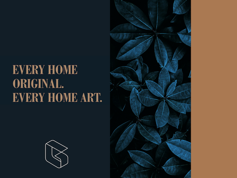
The website is grounded with dark blue, a traditional Gryphon colour. The copper fonts and accents stand out prominently against the dark background to create an ageless and elegance look.
Our guiding principle, “Every Home Original, Every Home Art”, is illustrated through the site design. The layout is eclectic, not your true box grid common in recent web design trends. Rather, we have an “open concept” layout that allows the entirety of the website to flow fluidly to tell our story. As you scroll through the homepage, images and text subtly and sensually emerge as individual elements transform upon a mouse hover to create an engaging experience.
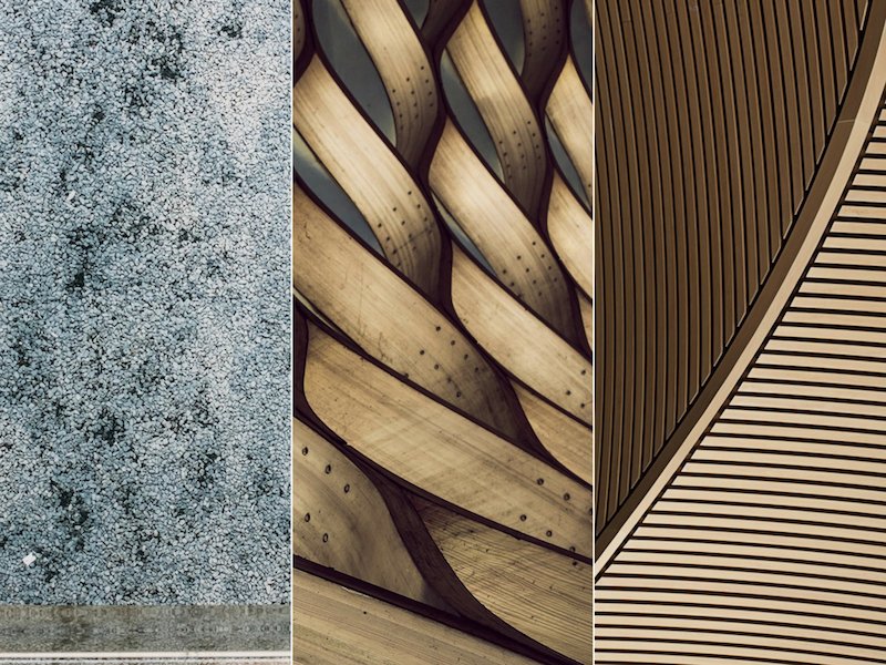
Detailed textures used on our homeowner care page
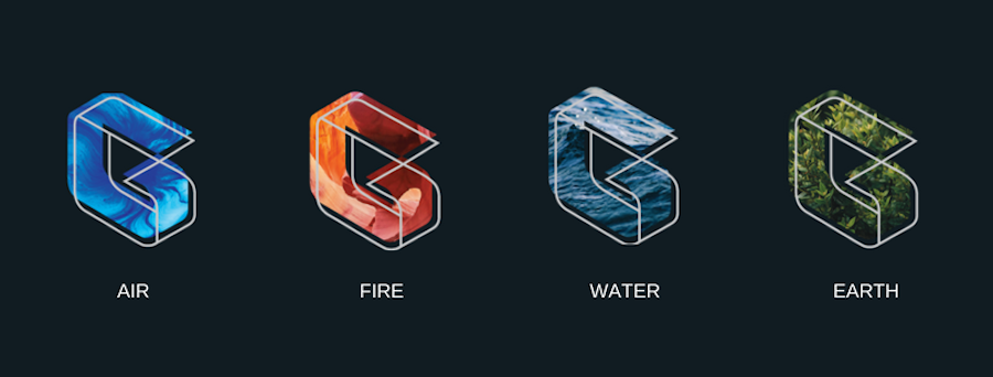
You may have noticed the logo “G” on the landing page changes with each visit to our website, conveying a unique experience each time you
The reason is we want our logo to be malleable. If you look closely, you may notice the two-layer design which provides an anchor and a creative component. The first layer is associated with our development side, which is depicted with the 3D structural framework representing construction, development, and building.
The second layer is the ever-changing “shifted-canvas” which represent Gryphons’ personality. With every changing canvas, we are a brand that is adaptable to the rapidly changing environment and technology. It also represents our artistic side by having a strong appreciation of fine arts, culture, and design.
“Life is a work of art over time and thus are our buildings”
Celebrating Our Roots
In Taiwan, our parent brand mascot is the Lion, and as the Lion transforms to spread its wings, a Gryphon emerges, majestically making its way overseas to make its mark in Vancouver.
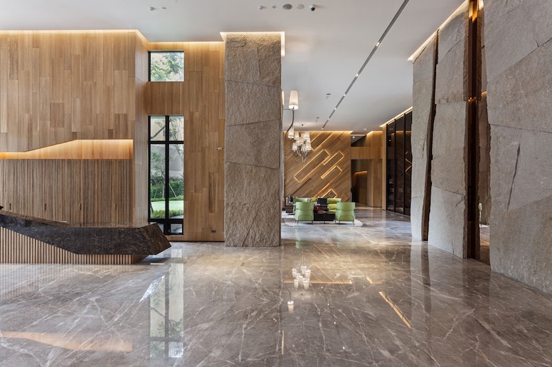
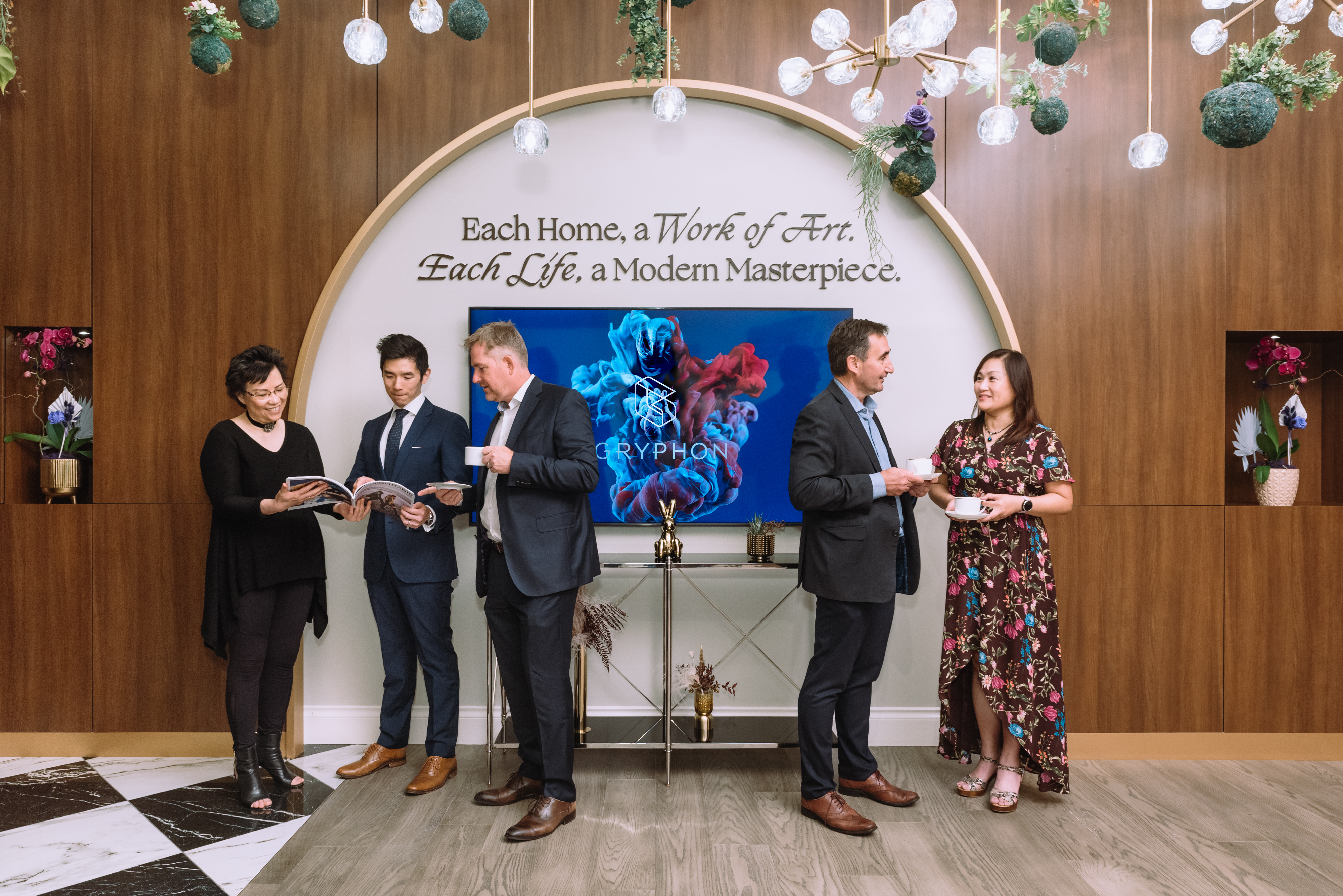
A lobby designed by Gryphon Development
Our first section pays homage to the traditions of our parent brand in Taiwan – their vision to create buildings worthy of their description as an art form, with their grand lobbies, curated art installation pieces, and sophisticated exteriors aimed at enhancing the building’s surroundings.
The next section highlights this part of our journey, with Westbury, a boutique collection of 8 homes in the prestigious Arbutus Ridge neighbourhood. Along with announcements of our upcoming projects in Vancouver West. We have committed ourselves to projects to at least 5 years down the road, and are delighted to make Vancouver our home.
A Site that Tells Our Story
As you can see, every component of the site is intentional, and our passion for art intertwines with every detail, including the menu, which is subtly overlaid on top of our feature art piece in our Vancouver art gallery + showroom, Gryphon Musée.
Our corporate website is designed in a way that is creative, approachable, stylish and authentic, encompassing all of our company’s values in a unique way. We hope through this piece you have gotten to know us at Gryphon a bit better. Stay in touch with us and our latest updates through our social media channels and our blog. We look forward to sharing our future corporate endeavours with the Greater Vancouver community.